There is no paywall on The Charlotte Mercury, and there won't be one. The bet is that you read a story today and come back tomorrow. So the reading is the product. If the text is hard on your eyes, nothing else we do matters.
On October 9 we changed the type on The Charlotte Mercury. The question wasn't what looks good. It was what's easiest to read. On that question, my taste turned out to be the wrong guide.
What the research says about taste
The largest study I could find on reading fonts was published in 2022 by Shaun Wallace and colleagues. They tested 16 common fonts on 352 adults. On average, people read 35 percent faster in their best font than in their worst, and understood just as much. But no font won for everybody. And the font people said they liked was a poor guide to the one they read fastest in.
The font I like is not evidence of anything. And there is no one right size, because the right size is different for every person reading this.
Three decisions
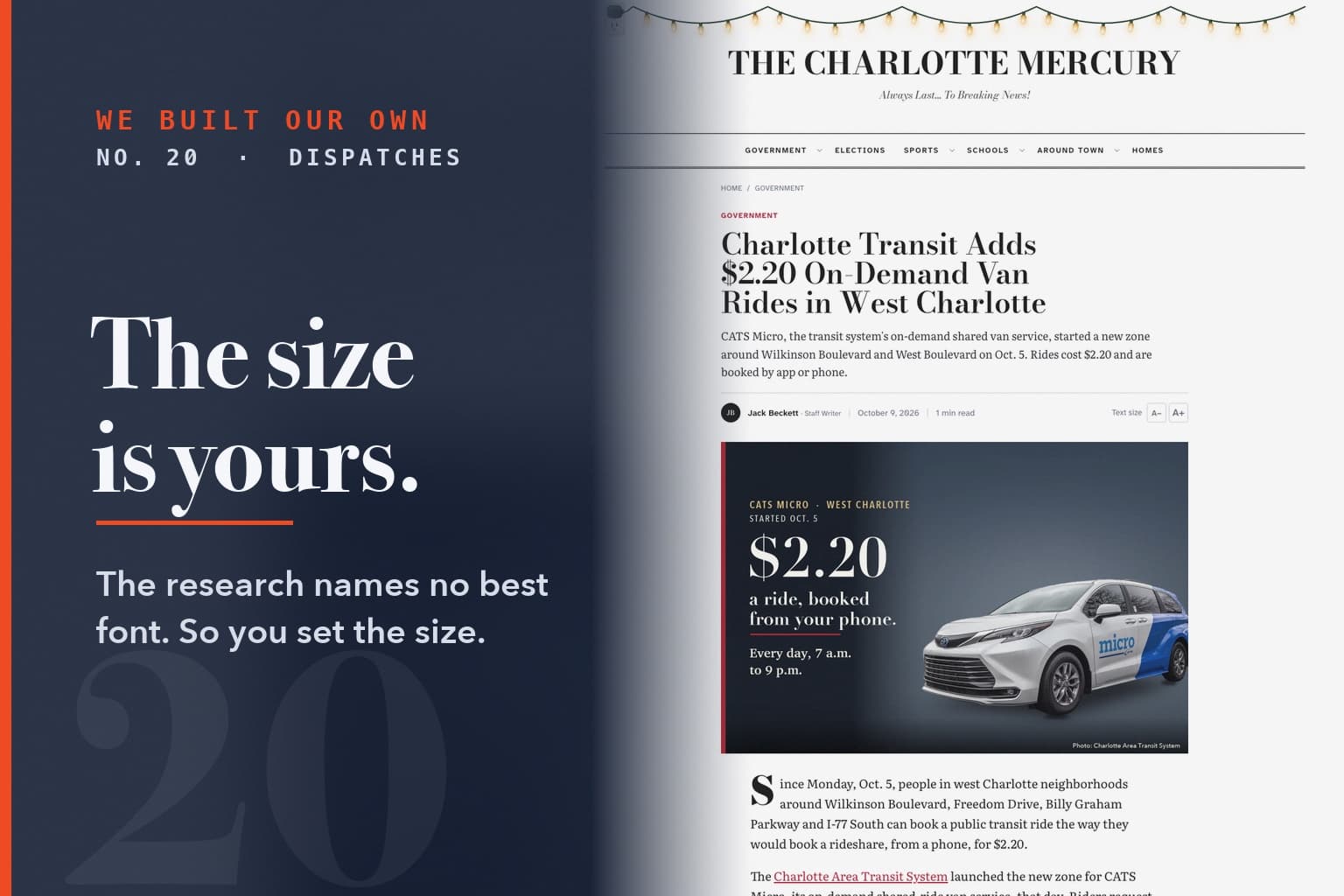
Style goes where you read a few words. The name at the top of the paper and the headlines are set in Bodoni, a tall, sharp face with a point of view. A headline is a handful of words set large. It can afford one.
Comfort goes where you spend minutes. The stories are set in Literata, a face made for long reading on screens, first built for Google Play Books. The text is bigger than it was. The small print, bylines, dates, the menu, is in a face the Braille Institute built for low-vision readers, so a capital I and a lowercase l can't be mistaken for each other.
The size is the reader's call. We could have let readers pick the font too. But the same study says people pick the one they like, not the one they read best in. So we chose the face and left you the one setting the research says matters: size. Every article on The Charlotte Mercury now has a Text size button. Pick once and your browser keeps it.
I chose the nameplate on looks, before any of this started. It's the one thing on the page that got to be my taste.
How it looks was my call. How big it reads is yours.
This is No. 20 in We Built Our Own, a Mercury Local series on building our own publishing system. Previous: The page still listed the former mayor.